Putting a Spring in Your Step With the March Release!
March comes in like a lion, and so does Centercode! We’ve got a fresh round of improvements that we just couldn’t wait to get out to you, so they're roaring in a few days early. The March release includes a bevy of UI fixes, tweaks, and improvements that are guaranteed to get your month started off right. And, as always, check out the list of bug fixes we've deployed throughout the month.
" data-embed-image="https://i.vimeocdn.com/video/1618457014-17ab70f93ffad51ae7c80269acaa9886f2bc8fa46f3795df283fec92c8b0d1be-d\_426" data-embed-signature="FjupgrmMnN6TIxqJtOwjXst84dt4tB73Y6GAdcKIzfj" data-embed-url="https://vimeo.com/802063890">
Replying in style
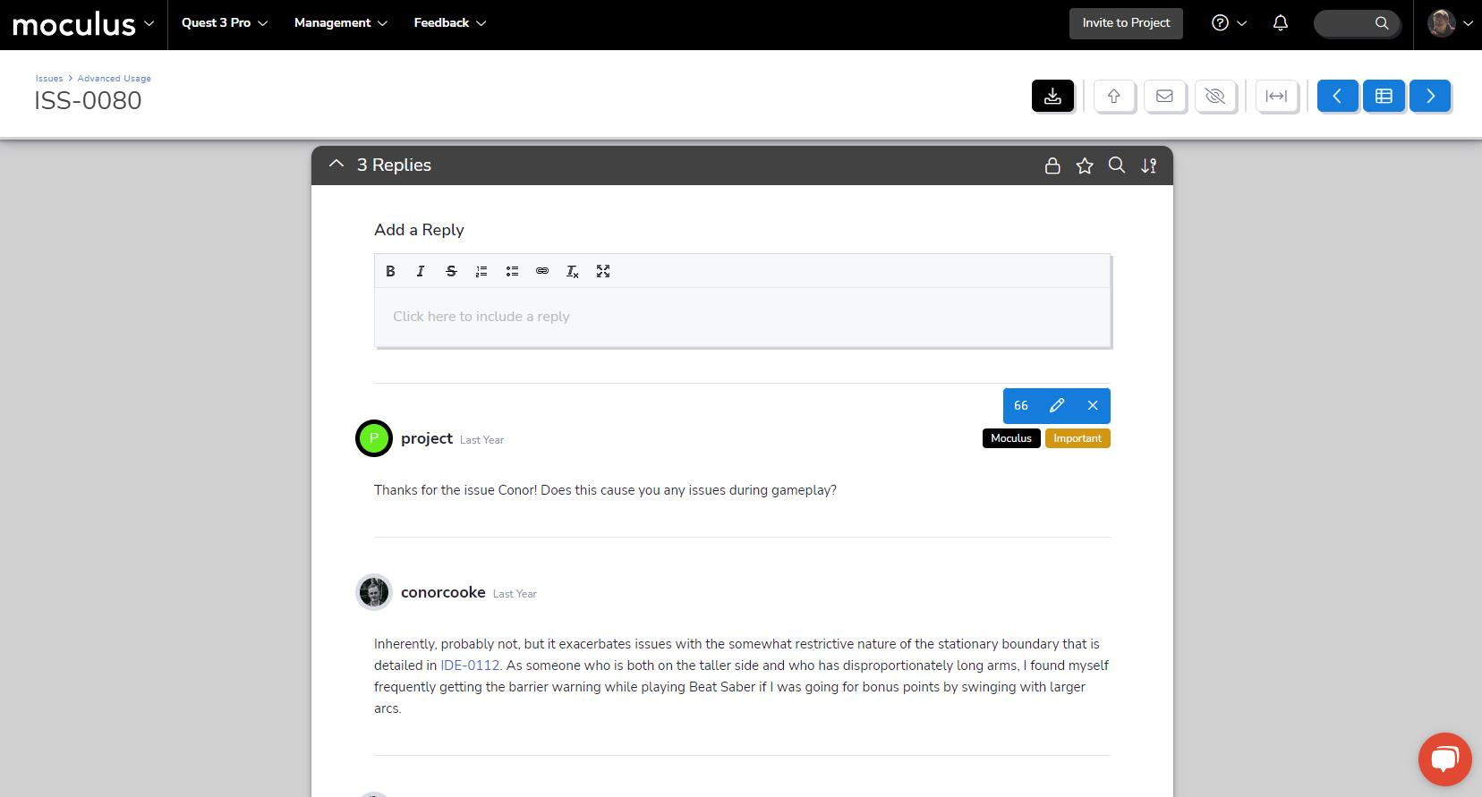
First up, we've made some BIG improvements to the Feedback Reply UI! Replies and comments in Feedback Management will work exactly the way you’re used to (none of the functionality has changed), but we’ve upgraded to a cleaner, more readable, and more modern-looking interface.
The first change you’ll notice is that the entire reply interface now sits in a single contiguous window. Second, when you hover over a post, you'll see your admin edit tools more readily. Finally, we’ve switched the staff and important reply indicators from colored borders to a clearer, easier-to-notice tag system (which will allow us to add additional tags in future releases!).
A new spring look for duplicates
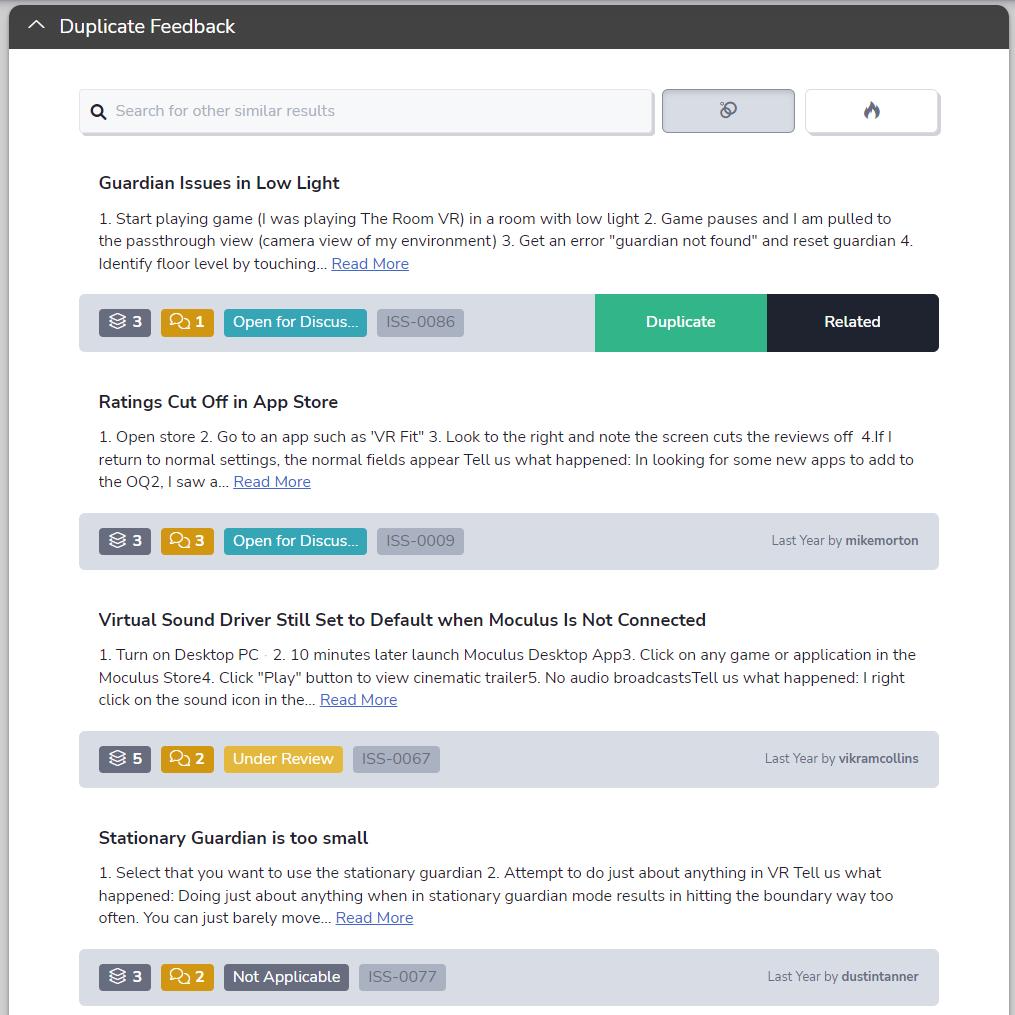
Next in line are some improvements to our Feedback Duplicate and Predictive Match interface. Like the Feedback Reply UI, we've switched the Duplicate Feedback and Predictive Match interface to a single clean and contiguous window (#twinsies). The adjusted button width ensures your ticket information on the left side of the bar won't get covered. We've finished it off with visual polish here and there, including updated colors, icons, and brand new tooltips for each icon.
Supporting our Support menu
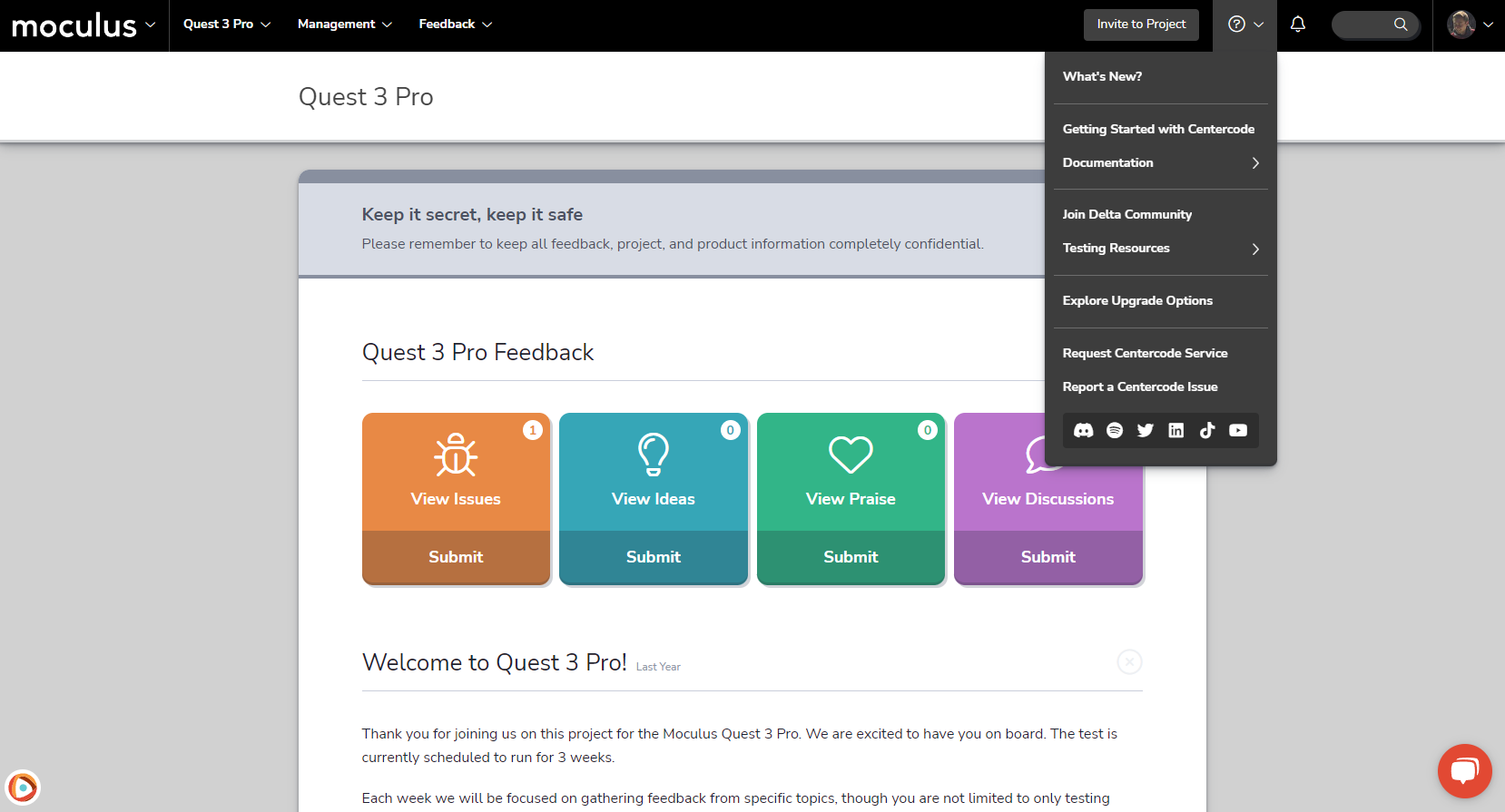
After years of supporting our customers, the Support Menu is getting some support of its own. We’ve added more helpful links and resources than you can shake a stick at! In the new Documentation and Testing Resources flyout menus, we’ve reorganized existing links and added a huge array of helpful resources, like our always-useful knowledge base articles, blogs, webinars, and guides. For members of the parasocial network, you'll also find links to our social media channels, so it's even easier to stay current with all the new content and resources we’re putting out! Lastly, the Subscription Dashboard link has moved from the Support menu to the User menu—a better fit for its role in your platform's functionality.
Keeping it simple
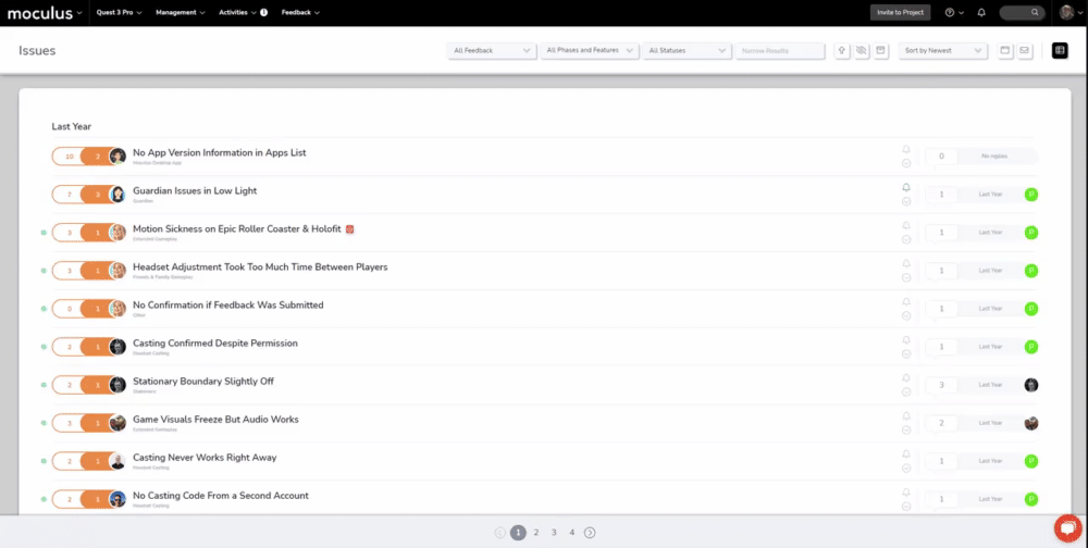
The Simple List is a key part of the feedback triage process. To make sure it presents the most important information in a concise and readable format (i.e., keeping it simple), we've tweaked the format to bring the ticket's Feature information into clearer focus. To accommodate this update, phase info has moved to a hover-over pop-up, so its easily accessible even with feature info in the spotlight.
Consolidated resource scheduling
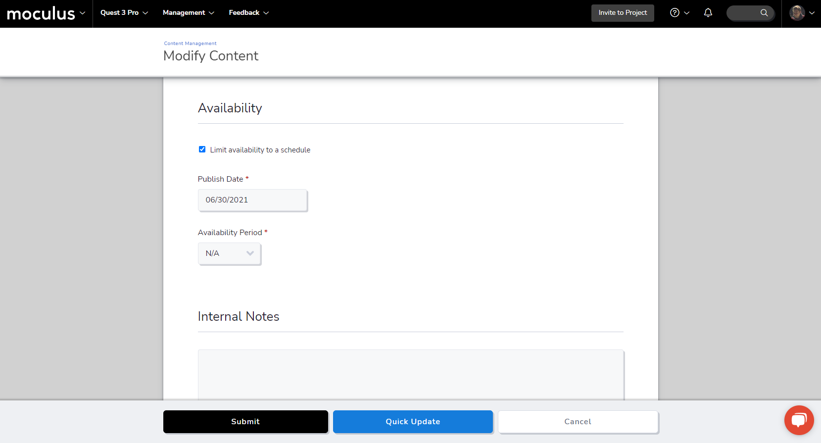
Next up, we've streamlined resource scheduling by consolidating set dates and availability periods into a single, uniform tool. Before now, there were two different methods for scheduling resources in the platform: you had to choose specific start/end dates for some and set an availability period for others. We've decreased friction by combining these two methods and making that change consistent across all types of resources.
To schedule a resource for future publication or set an availability period, enable the Limit availability to a schedule checkbox. This option lets you set a publish date and, if applicable, choose how long it will remain available once published. Expired content will be archived automatically to keep your resource management workspaces cleaner.
A word of note: All existing customer resources will be updated to this new style. Any expired resources will be sent to your Archive automatically. The system will update any active resources that expire in less than 30 days so they'll deactivate right on time. Resources with expiration dates that are more than 30 days out have been set to "N/A" and should be checked manually.
A note about notifying
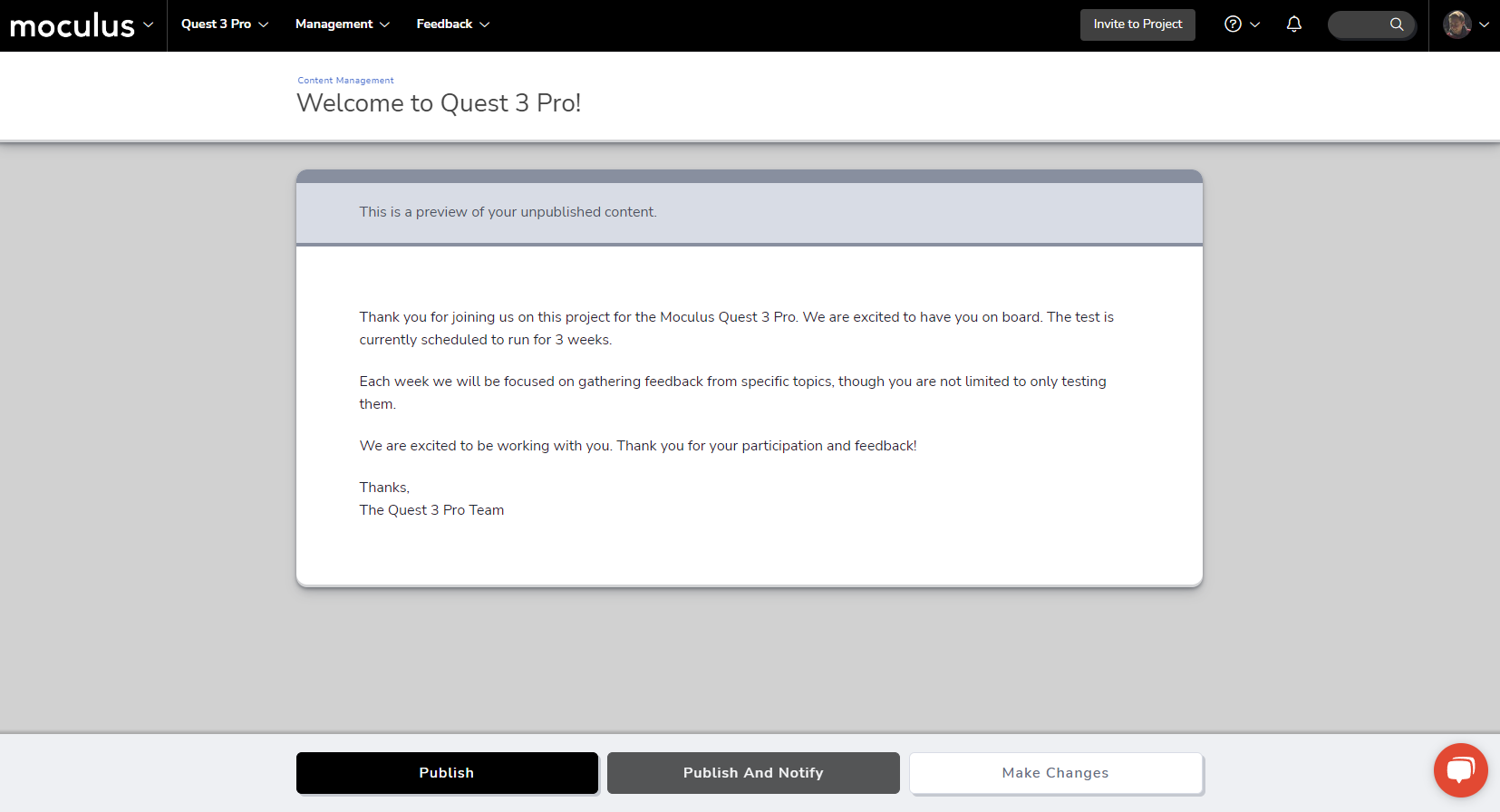
Publishing resources is that much more convenient now, thanks to a small but meaningful interface update! When you're publishing any resource (content, surveys, releases, etc), you'll have the option to Publish and Notify. you’ll have the option to “Publish and Notify”. Previously, these were two separate actions: you had to publish a resource, then manually select the Notify tool. This new option streamlines that flow, allowing you to immediately publish a resource and trigger the notify tool with no extra navigation required!
To complement this change, we’ve cleaned up and consolidated the various page headings on the publish page into a single uniform infobox. Letting your testers know about the new resources you’ve created for them is now easier than ever!
The magical art of tidying up
And last on the list, we’re getting a head start on our spring cleaning by tidying up various UI elements all across the site. We’ve corrected text spacing and button transparency issues on many different pages and made slight adjustments to default feedback type colors. In addition, we’ve slightly increased the font size on some of our smallest text items throughout the site. This ensures they conform to accessibility font contrast standards no matter which colors your visual themes use. You may not notice these small changes, but you can trust that, like being in a clean house, it just feels better.
User Interface & Experience
- The font size used for navigation trails was increased slightly to conform to maintain accessibility standards
