New year, new look!
We're starting the year off with a refreshed design to enhance your testing experience! Centercode's January release focuses on visual and UI changes designed to bring you and your users a cleaner, more modern interface that improves usability, improves the use of screen space, and highlights the features that keep your tests moving. We've revamped the look of multiple areas of the platform, as well as made a few site-wide layout and UI changes that you're sure to love!
Keep those New Years (screen) resolutions!
The first changes you'll probably notice (especially if you're on a wide monitor!) are the adjustments we've made to the global UI to better use your available screen space. We've tweaked various page widths across the site to improve visual consistency and better utilize existing screen real estate!
Along those lines, we've made some updates to top headers on many pages. In general, top headers will no longer be sticky, which will save screen space when scrolling around pages at lower resolutions. Additionally, top headers and header buttons will now rest on top of your background and will share visual theme color choices with your existing background text options, so as long as you've got those set up appropriately no adjustments should be necessary.
These changes, in addition to some color and spacing adjustments, are designed to keep your site looking readable and consistent across a much wider range of screen resolutions!
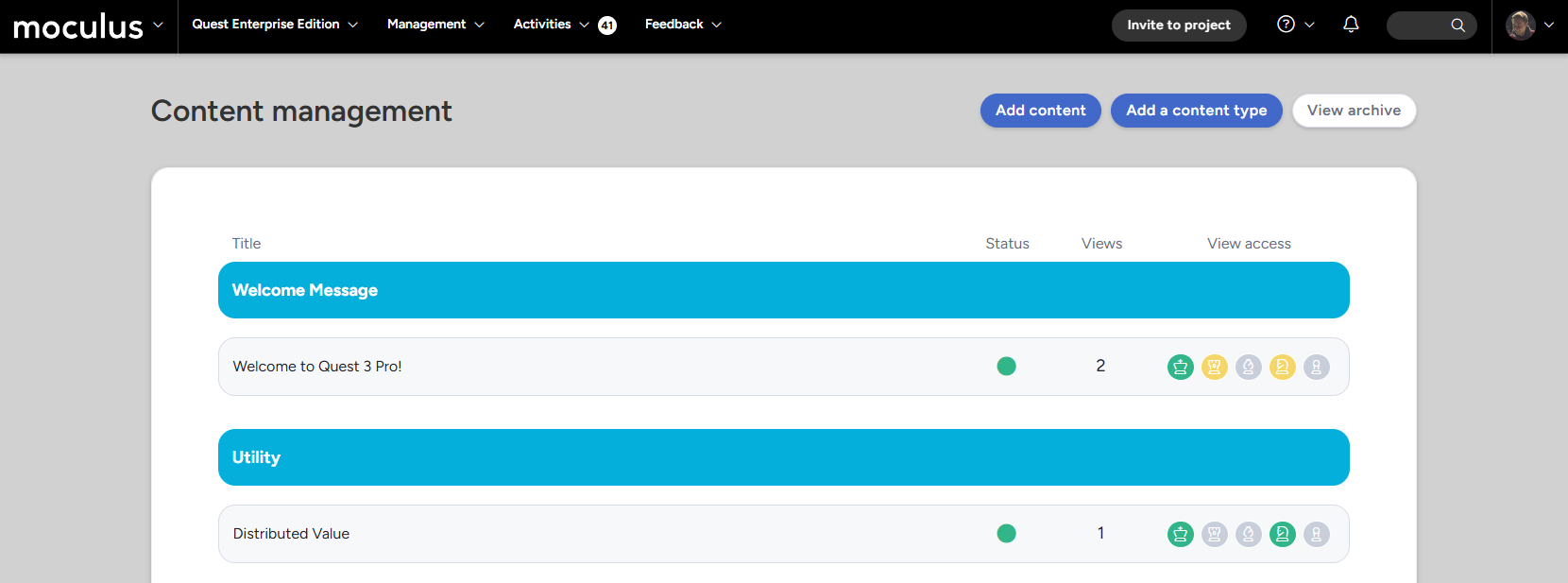
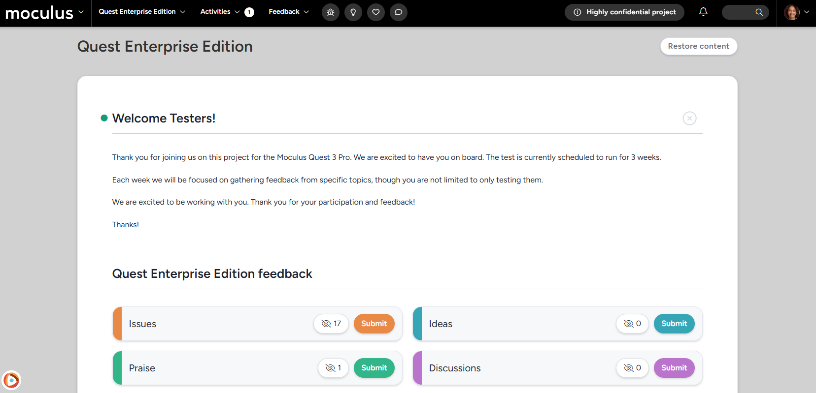
No place like (Project) Home!
Next up we've got some exciting changes coming to your project home pages! We've made a few tweaks to both the look and layout of your project home pages designed to improve test flow, and help you get important information in front of your testers. The first change you'll notice is that now any content you have set to display on the project home will appear at the top of the page, with the feedback buttons now appearing after any custom content, ensuring that the first thing your users see is any important test information you want to get out to them!
Additionally, we've given our feedback buttons a more compact modern design, while maintaining all the same viewing, submitting, and informative capabilities.
One last change that is not specific to the project home (but IS in this screenshot!) is the addition of a tester-facing "Highly confidential project" warning in the menu bar for any of your projects set to "Private", to provide testers with a constant reminder of their non-disclosure and to keep project info confidential.
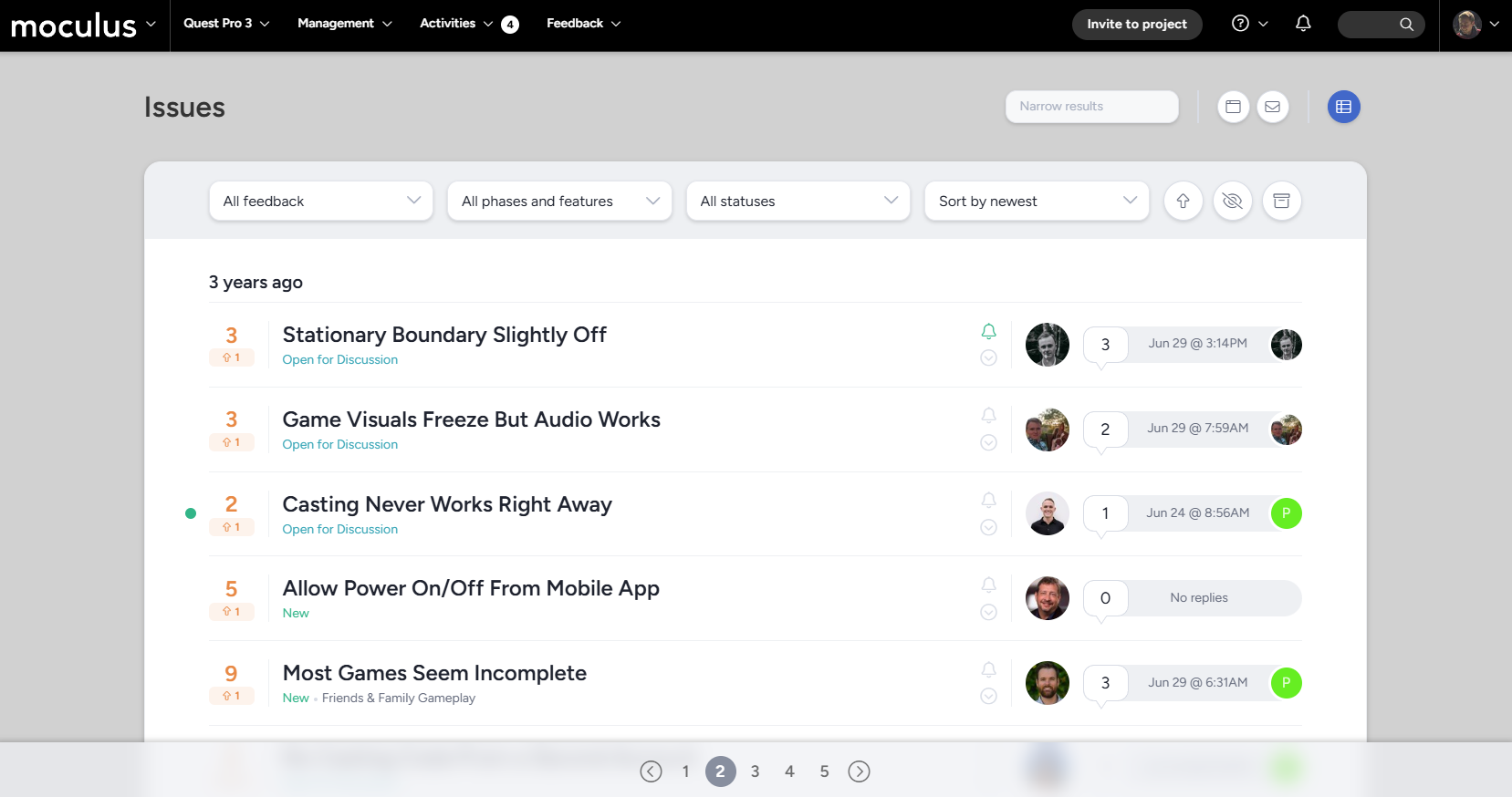
Feedback list changes!
And finally, we've made some big changes to the layout of our feedback list, presenting all of the same handy information rearranged for visual clarity and readability!
First on the list (and farthest to the left!) is an update to the vote/score widget. Both the admin and tester-facing versions have been given a facelift to improve their visual clarity, and the admin-facing version of this new design places a larger emphasis on the impact score of the ticket.
Next up, we've made some adjustments to the Feedback title area and how that information is presented. Both the "archived" and "blocked" icons will now appear to the left of the title, as well as archived ticket titles now appearing in grey, to help you visually determine which tickets need immediate action (or have already been acted on). Additionally, we've adjusted the styling for how statuses are presented, now giving them a visually distinct foreground color (but no background color), to reduce clutter in the title bar while still presenting all the same visual information you're used to seeing.
Lastly, we've moved the ticket submitter avatar to the right side of the bar, to keep it grouped with the other user-focused information (such as total replies and last reply.)
Data Engine & Custom Reports
- Charts have been corrected in generated report PDF & PNG files.