Fixes
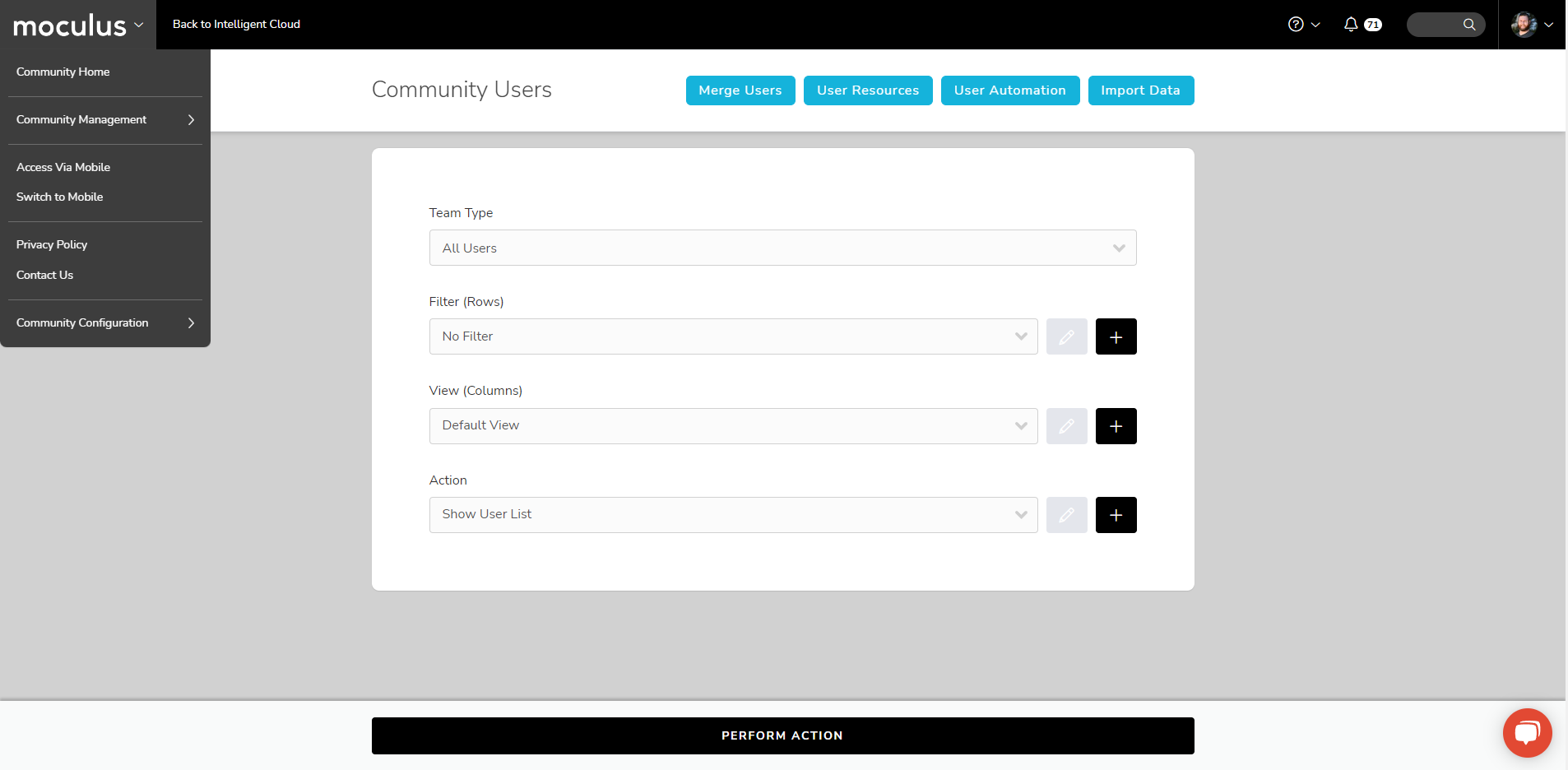
Feedback Management
- Resolved an issue that was preventing high-traffic feedback items from loading properly in the feedback management view
The latest updates and improvements to the Centercode platform.
Spring has officially sprung, and Centercode’s garden is positively blooming with a fresh batch of new features and improvements. And boy, do we have some exciting ones for you this month, folks! We’ve got some powerful new tools and a few convenient enhancements to our existing interface, all designed to make triaging your feedback faster and easier than ever before. And, as always, check out the list of bug fixes we've deployed throughout the month!
" data-embed-image="https://i.vimeocdn.com/video/1650275200-abc667f566ee9405cb805e3ce6bc3beeb6d9e615165c0c77ef07b1a8c459dae3-d\_426" data-embed-signature="P4a8oISyJoagEizdqcRR13Z9KQm3YnRyOxAmewxY0Aw" data-embed-url="https://vimeo.com/815500903">
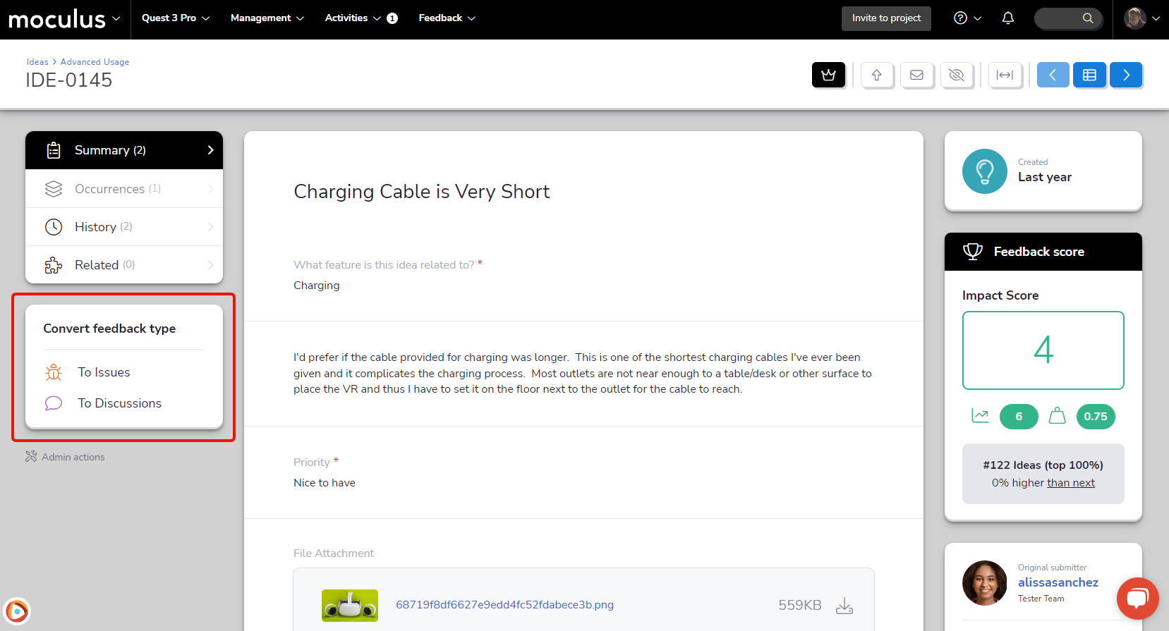
Drumroll, please! We’re proud to introduce our brand new first-class Feedback Type Conversion tool! The ability to easily convert one feedback type to another is one of our longest-standing and most requested features, and we think this new tool really knocks it out of the park! This simple but powerful tool allows you to move feedback from one type to another with a single click (and confirmation)!
Designed with simplicity and ease of use in mind, the feedback type conversion tool will bring over all of your critical ticket data without the need for any manual field mapping. Any fields not converted automatically will be stored in the ticket history, so no information will ever be lost. Additionally, the system will automatically notify the ticket submitter, letting them know their feedback has been converted to a new type so they can keep track of it. You’ll find these new options located in the right-hand menu, just below your macro list when viewing a ticket. It's also available in the new Quick Feedback Update tool, which we'll explain in the section below.
This one has been on a lot of your wishlists, and it took a lot of hard work and planning to get it where we wanted in terms of flexibility and ease of use. Once you’ve had a chance to get your hands on it, we’d love to hear what you think!
We’ve been making a lot of tweaks to the information presented in feedback cards, which you see when viewing your feedback in dashboards or the feedback simple list. You’ve let us know (emphatically!) that these two methods of reviewing feedback are an integral part of your daily workflows. This time, we’ve got one we really think you’re going to love: the Quick Feedback Update tool, which gives you the ability to take all kinds of actions on a ticket right from the feedback simple list or dashboard!
To access this new functionality, simply open the expanded view of any feedback ticket card, and click the new Quick update hyperlink. This link will present you with a drop-down list of a huge variety of actions, including status updates, macros, and even the new feedback conversion tool mentioned above! You'll also be able to quickly reply to a ticket from the card itself (both as a single action or in addition to one of the previously mentioned actions). We love giving you solutions that increase functionality and reduce friction at the same time!
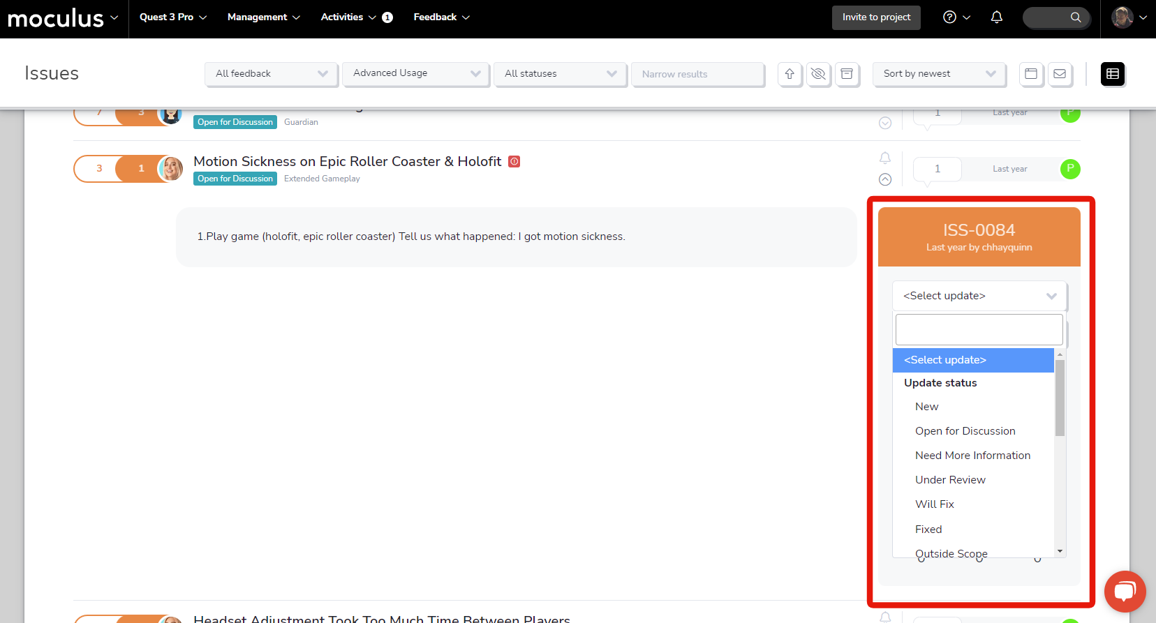
Note: Having full access to the new quick update menu requires having full access to the ticket itself. This means that you'll only see the full list of actions if you already have the ticket checked out. However, keep reading to learn about another awesome new feature developed in tandem with quick update that will really unlock the full power of this tool!
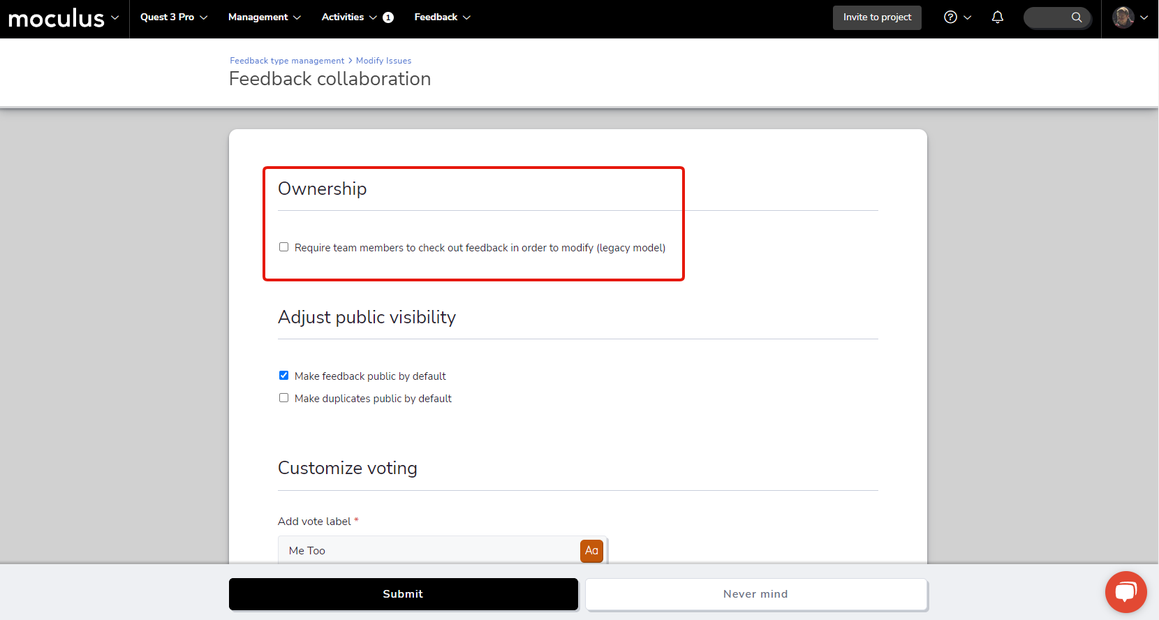
Sticking with the trend of streamlining the feedback triage process, we’ve got an (optional!) simplification that removes the need to take ownership of (or “check out”) a ticket before making edits. We’ve added an ownership section to the top of the Feedback collaboration settings menu within each feedback type, which contains the new checkbox “Require team members to check out feedback in order to modify”. Leaving this box unchecked means that any user who is a member of the feedback owner team can make edits at will, without taking direct ownership of the ticket!
Note: All existing feedback types will automatically have access to this new functionality! If you would like your existing projects/feedback types to function the same as before where checking out/owning the feedback is REQUIRED to make edits to a ticket you will need to enable the “Require team members to check out feedback in order to modify” checkbox in the feedback collaboration settings for each of your existing feedback types.
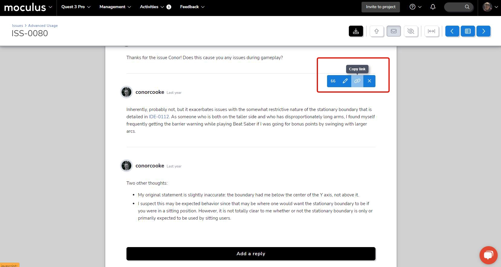
Next on the list, we’ve got a new addition to our feedback reply toolbar that makes locating and sharing user replies easier than ever before! The new "Copy link" button allows you to create a link directly to a piece of feedback that will highlight and automatically scroll to the linked reply (as well as load the appropriate page of replies, if applicable). Whether you’re directing your triage teams’ attention to a specific reply, or requesting an update from a user regarding a previous reply, this new button will make pointing users right where they need to go a snap!
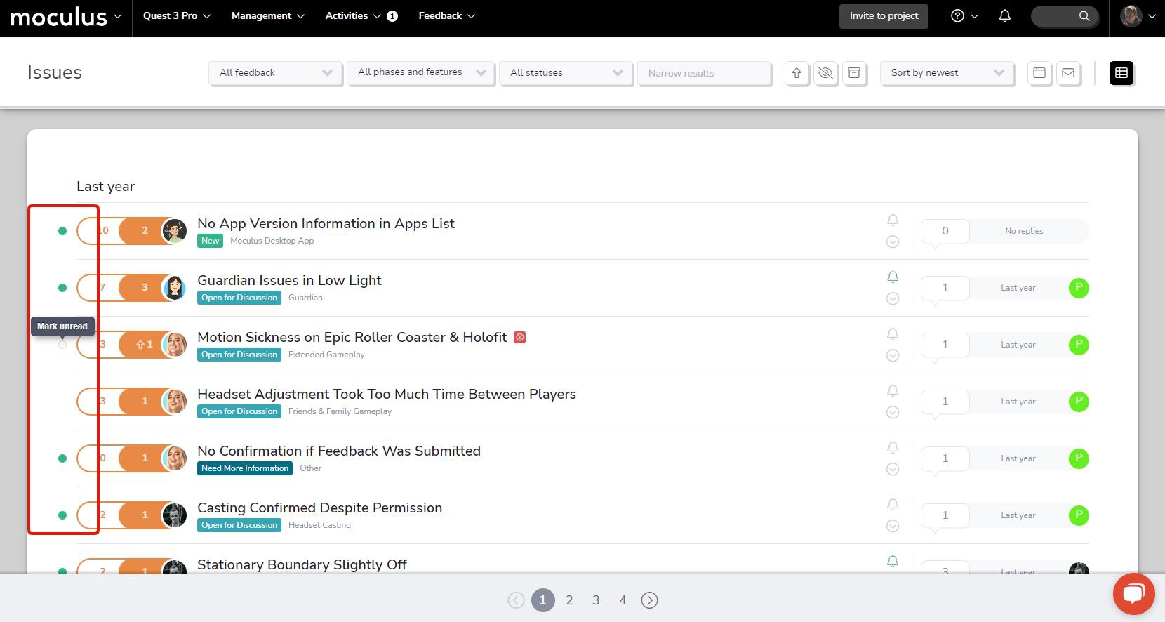
And finally, we’ve got another addition to the ongoing list of feedback simple list tweaks and improvements. This time, we’ve added a bit of interactive functionality to the “New” indicator icon, allowing you to dismiss it without manually viewing the associated ticket. This change additionally allows you to re-mark a ticket as new if you’d like to remind yourself to check in on it later. This simple but impactful change gives you a lot more control over which pieces of feedback you’d like to keep a closer eye on, all without navigating out of the feedback simple list!
We've updated the platform to use sentence case for all of our text! Instead of seeing a mix of title case, sentence case, and ALL CAPS, this change displays text in a way that's consistent, scannable, and easier on the eyes.
Unlike title case, which has many different capitalization rules and variations, sentence case is simple and intuitive: the first letter of the first word is capitalized, while the rest of the words (except for proper nouns and acronyms) are lowercase. Because it resembles the way we write, sentence case is more natural to read and scan in English, making it easier to retain information. The uniformity of lowercase letters also reduces visual clutter, which improves navigation and helps important info stand out.
While the change might take some getting used to (especially if you've been with Centercode for a long time), we hope it makes communication in Centercode more effective for you, your teams, and your testers!
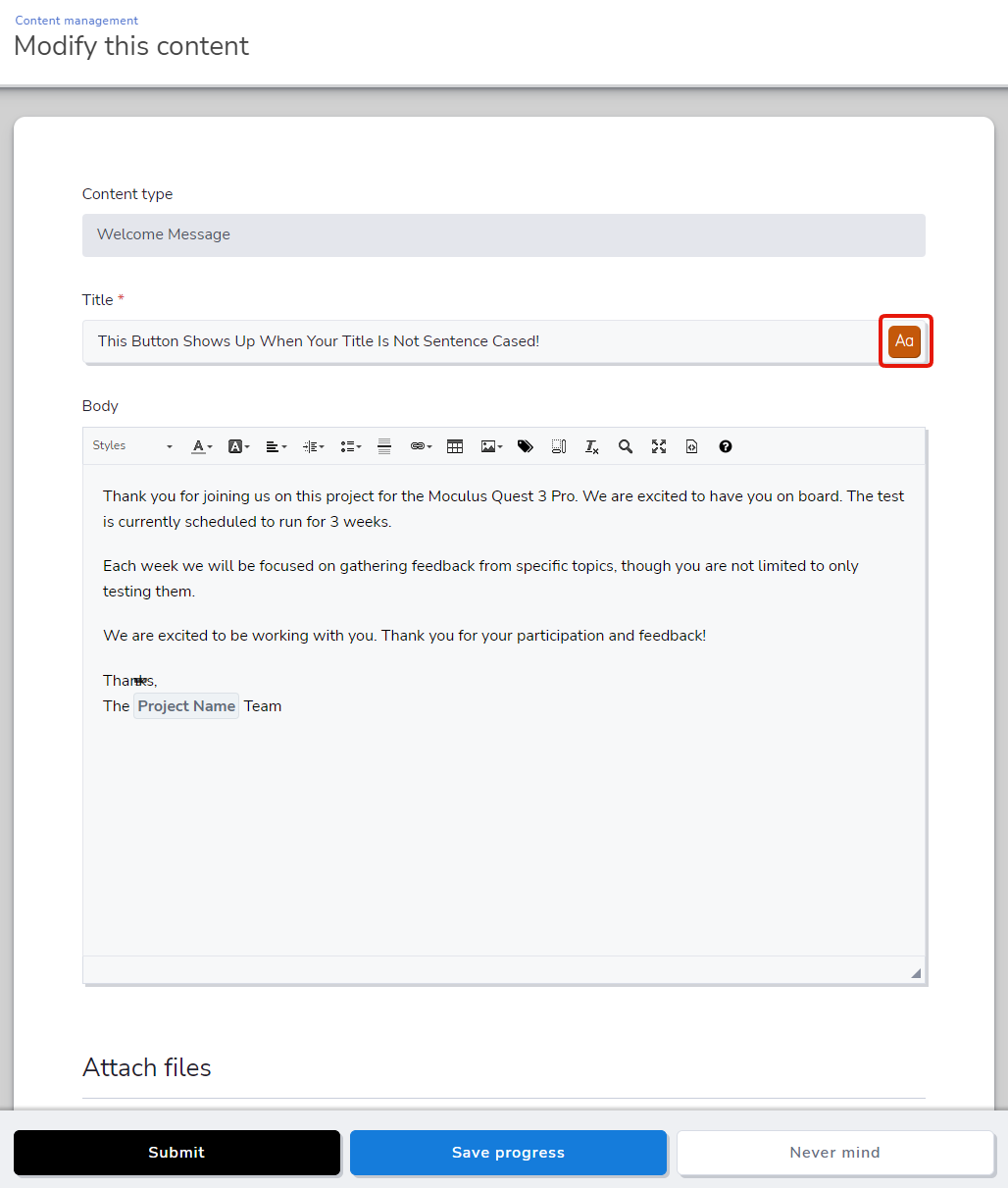
Connected to the sentence case update, we've added a nifty little feature that makes sentence casing feedback summaries and other title fields refreshingly simple. The Case Tool button appears on the right edge of a title or name field when it detects a capitalized word in the middle of a phrase. Clicking this button automatically sentence cases the text inside—meaning you no longer need to install a Chrome extension or wear out your eyes manually casing word after word. In addition to recognizing ALL CAPS as acronyms, it recognizes your company name, community name, and project name as proper nouns and keeps them appropriately capitalized.
March comes in like a lion, and so does Centercode! We’ve got a fresh round of improvements that we just couldn’t wait to get out to you, so they're roaring in a few days early. The March release includes a bevy of UI fixes, tweaks, and improvements that are guaranteed to get your month started off right. And, as always, check out the list of bug fixes we've deployed throughout the month.
" data-embed-image="https://i.vimeocdn.com/video/1618457014-17ab70f93ffad51ae7c80269acaa9886f2bc8fa46f3795df283fec92c8b0d1be-d\_426" data-embed-signature="FjupgrmMnN6TIxqJtOwjXst84dt4tB73Y6GAdcKIzfj" data-embed-url="https://vimeo.com/802063890">
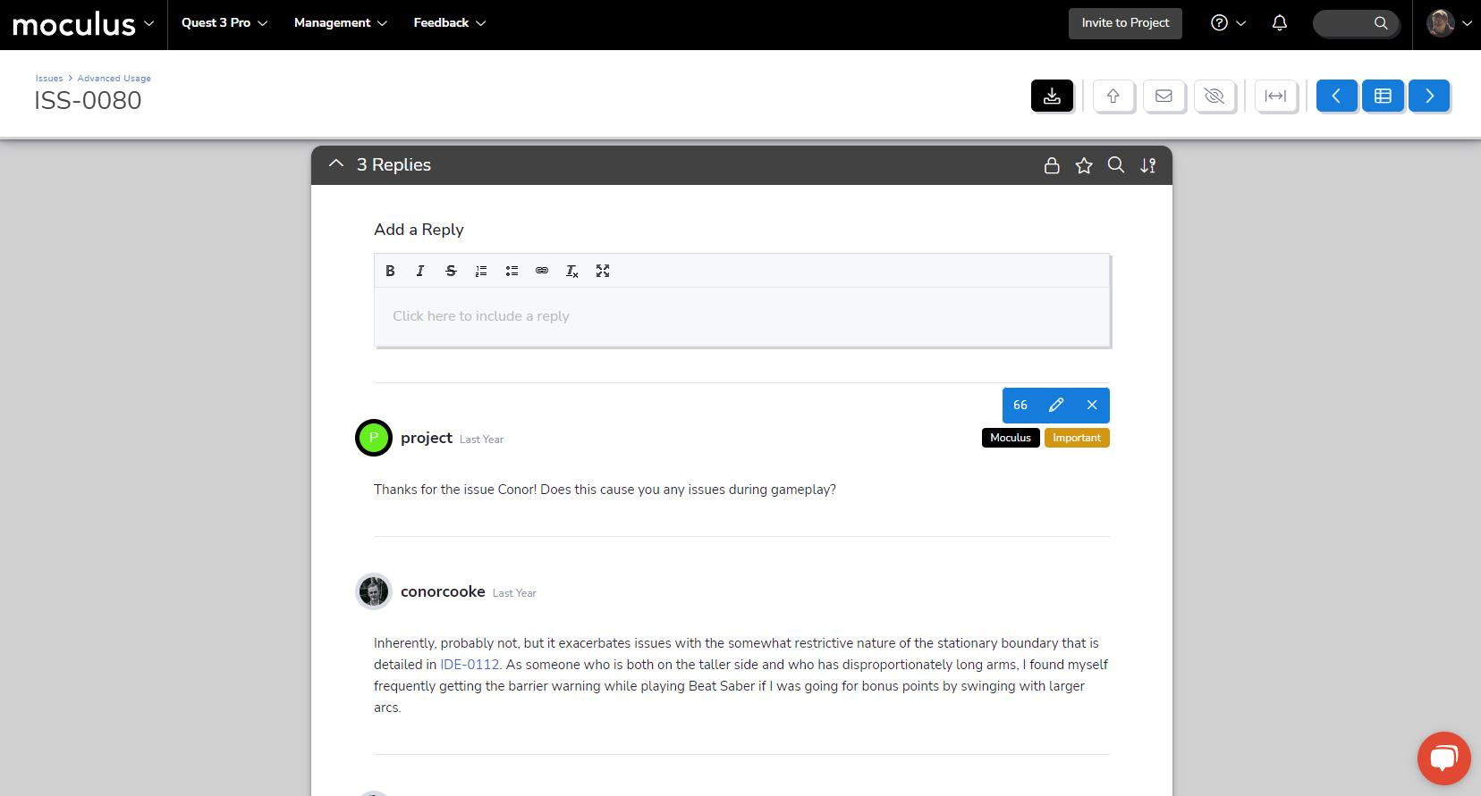
First up, we've made some BIG improvements to the Feedback Reply UI! Replies and comments in Feedback Management will work exactly the way you’re used to (none of the functionality has changed), but we’ve upgraded to a cleaner, more readable, and more modern-looking interface.
The first change you’ll notice is that the entire reply interface now sits in a single contiguous window. Second, when you hover over a post, you'll see your admin edit tools more readily. Finally, we’ve switched the staff and important reply indicators from colored borders to a clearer, easier-to-notice tag system (which will allow us to add additional tags in future releases!).
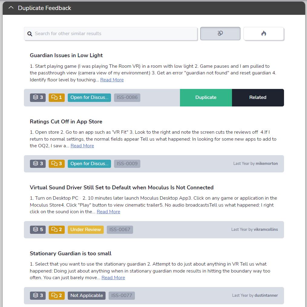
Next in line are some improvements to our Feedback Duplicate and Predictive Match interface. Like the Feedback Reply UI, we've switched the Duplicate Feedback and Predictive Match interface to a single clean and contiguous window (#twinsies). The adjusted button width ensures your ticket information on the left side of the bar won't get covered. We've finished it off with visual polish here and there, including updated colors, icons, and brand new tooltips for each icon.
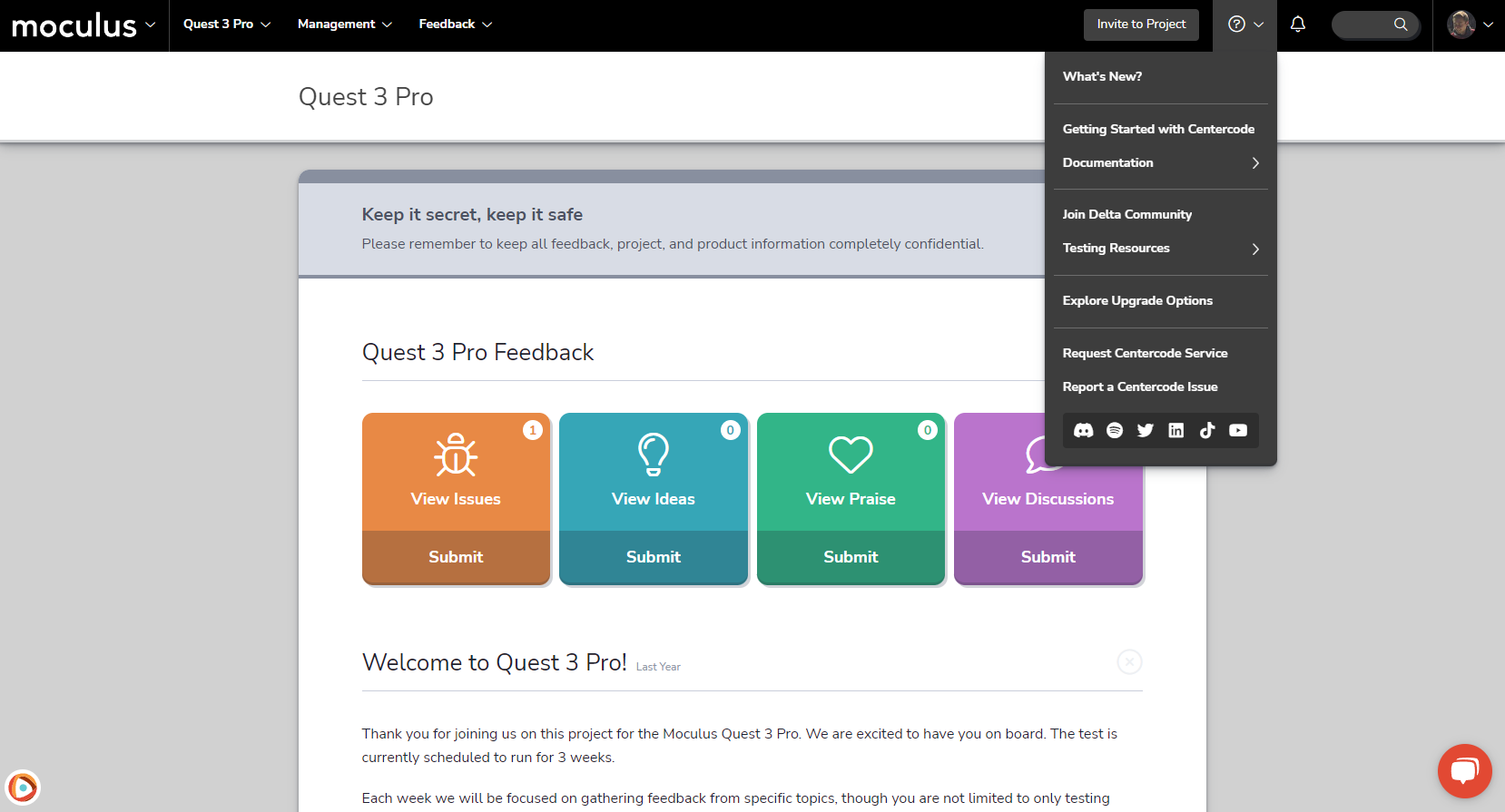
After years of supporting our customers, the Support Menu is getting some support of its own. We’ve added more helpful links and resources than you can shake a stick at! In the new Documentation and Testing Resources flyout menus, we’ve reorganized existing links and added a huge array of helpful resources, like our always-useful knowledge base articles, blogs, webinars, and guides. For members of the parasocial network, you'll also find links to our social media channels, so it's even easier to stay current with all the new content and resources we’re putting out! Lastly, the Subscription Dashboard link has moved from the Support menu to the User menu—a better fit for its role in your platform's functionality.
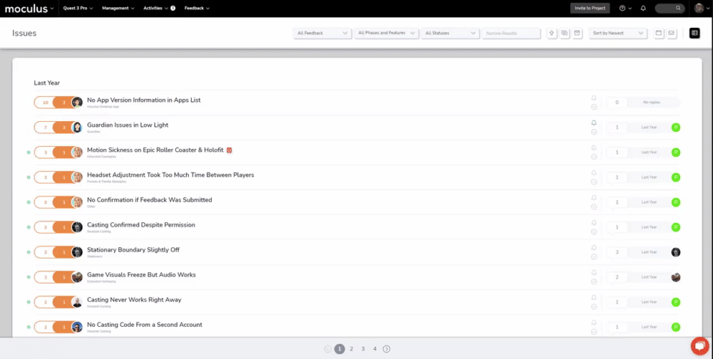
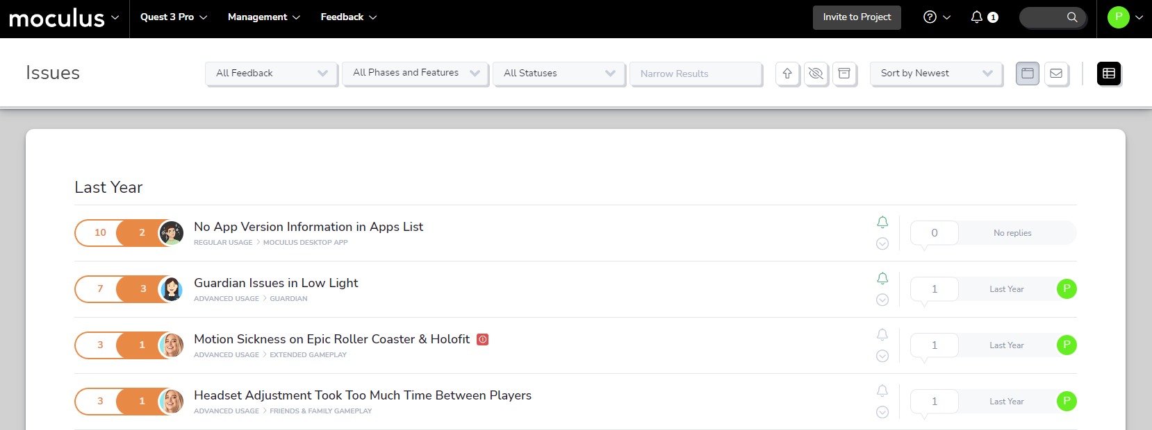
The Simple List is a key part of the feedback triage process. To make sure it presents the most important information in a concise and readable format (i.e., keeping it simple), we've tweaked the format to bring the ticket's Feature information into clearer focus. To accommodate this update, phase info has moved to a hover-over pop-up, so its easily accessible even with feature info in the spotlight.
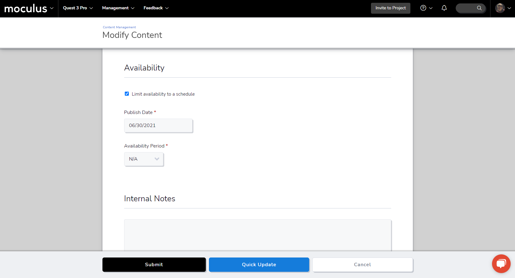
Next up, we've streamlined resource scheduling by consolidating set dates and availability periods into a single, uniform tool. Before now, there were two different methods for scheduling resources in the platform: you had to choose specific start/end dates for some and set an availability period for others. We've decreased friction by combining these two methods and making that change consistent across all types of resources.
To schedule a resource for future publication or set an availability period, enable the Limit availability to a schedule checkbox. This option lets you set a publish date and, if applicable, choose how long it will remain available once published. Expired content will be archived automatically to keep your resource management workspaces cleaner.
A word of note: All existing customer resources will be updated to this new style. Any expired resources will be sent to your Archive automatically. The system will update any active resources that expire in less than 30 days so they'll deactivate right on time. Resources with expiration dates that are more than 30 days out have been set to "N/A" and should be checked manually.
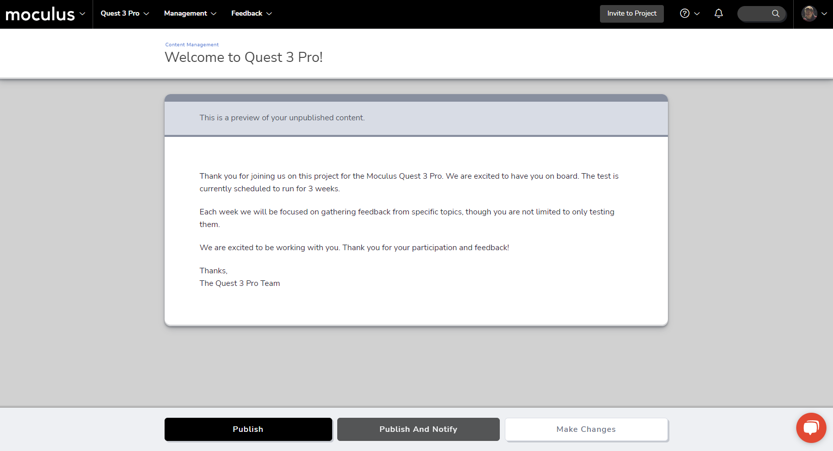
Publishing resources is that much more convenient now, thanks to a small but meaningful interface update! When you're publishing any resource (content, surveys, releases, etc), you'll have the option to Publish and Notify. you’ll have the option to “Publish and Notify”. Previously, these were two separate actions: you had to publish a resource, then manually select the Notify tool. This new option streamlines that flow, allowing you to immediately publish a resource and trigger the notify tool with no extra navigation required!
To complement this change, we’ve cleaned up and consolidated the various page headings on the publish page into a single uniform infobox. Letting your testers know about the new resources you’ve created for them is now easier than ever!
And last on the list, we’re getting a head start on our spring cleaning by tidying up various UI elements all across the site. We’ve corrected text spacing and button transparency issues on many different pages and made slight adjustments to default feedback type colors. In addition, we’ve slightly increased the font size on some of our smallest text items throughout the site. This ensures they conform to accessibility font contrast standards no matter which colors your visual themes use. You may not notice these small changes, but you can trust that, like being in a clean house, it just feels better.
It’s February, and love is in the air! In this month’s Centercode release, we’re bringing you a heart-shaped box of bite-sized new features and improvements. Follow the trail of release note rose petals to learn about each of these exciting new Centercode additions! And, as always, check out the list of bug fixes we've deployed throughout the month.
" data-embed-image="https://i.vimeocdn.com/video/1601919971-4ce7ae0deea35f17be2230c8d7e17ba4975920cd4f77310dd072e2030dc92955-d\_426" data-embed-signature="7JD99rAfNyjGNzEsAuj2R5azr6Nsx9vLLQPZASeYqBK" data-embed-url="https://vimeo.com/795356309">
The first arrow in Cupid’s release note quiver is a slight adjustment to last month’s community project list UI update. By popular demand program groups are returning to the Community Home project list! We always love hearing from you what works and what doesn’t, and you let us know that program grouping was an essential way of managing large project lists. So, without further ado, we present the (new) new Community Home project list!
Invite users into your community or projects (and possibly your heart?) faster than ever before with this handy new addition to the menu bar! This button keeps the ability to add users to your project or community front and center (well, slightly to the right) at all times. Additionally, we’ve given the Quick Invite menu a little polish to bring it in line with last month’s big UI update. Now get out there and get inviting!
Centercode's search tool is getting a little love. Previously known as the “Knowledge Base,” we’ve given this handy tool a new name (now simply “Search”) and a makeover. Along with the name change, we’ve also updated (and added a more visible button) to the Search Reference Guide, which details precisely how to target the data you’re looking for!
Last but not least, a quick update to the look of the Simple List feedback view. The intent of the Simple List is to present users with a succinct, at-a-glance summary of feedback tickets. But this view looked busier than we wanted it to, especially with the color-coded status tags. These tags will remain in the more information heavy feedback view types, such as the dashboard view. We stripped those tags out of Simple Lists(while maintaining the ability to filter the list by status if that is your intended purpose) to keep things readable and easy to navigate!
A Rose by Any Other Display Name
Usernames are taking a new name: display names. As an admin, nothing's changed—you'll still have access to the full names of your members.
What's in a name, you ask? The switch gives you more flexibility to manage your testers' privacy without sacrificing the security of having identifying info on file. The new label makes it clear to your users when completing this field that this may be shown to other participants, which is still something you have control over in your Project Settings.
More (Love) Language Updates
Communication is key to a successful relationship, so we focused on increasing clarity within your platform experience. Page titles and error messages are now more consistent. Blank states are also getting some much-needed love and showing off a little more personality. We hope these updates, while subtle, will win your heart.
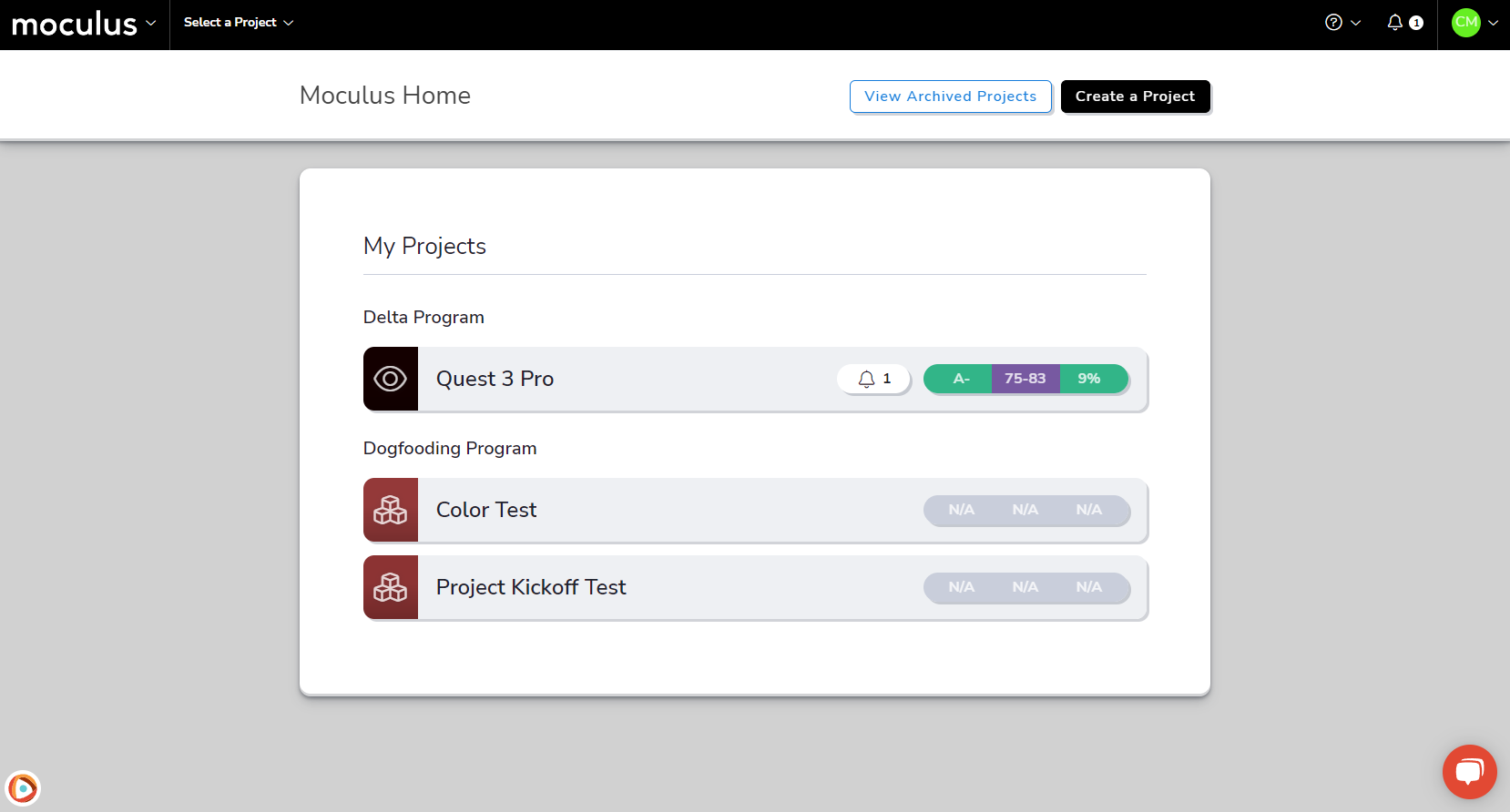
Happy New Year! 🎇 We’re starting off 2023 by hitting the (metaphorical) gym and getting the site in shape with some visual improvements. We’ve beefed up the community homepage, added definition to the Success and Delta Health Score bars, and toned site wide with small but impactful visual tweaks. Finally, you can see proof of our sustained effort by checking out the regular bug fixes listed below.
" data-embed-image="https://i.vimeocdn.com/video/1582754348-978ddf2328596693d427dcd75a9d108381c93b9b213712169635ed35a928a61d-d\_426" data-embed-signature="ox3iY2P5MkJ8ZlMDN94peA0ZQ5pZf8GDA4OATHGNkWc" data-embed-url="https://vimeo.com/787208148">
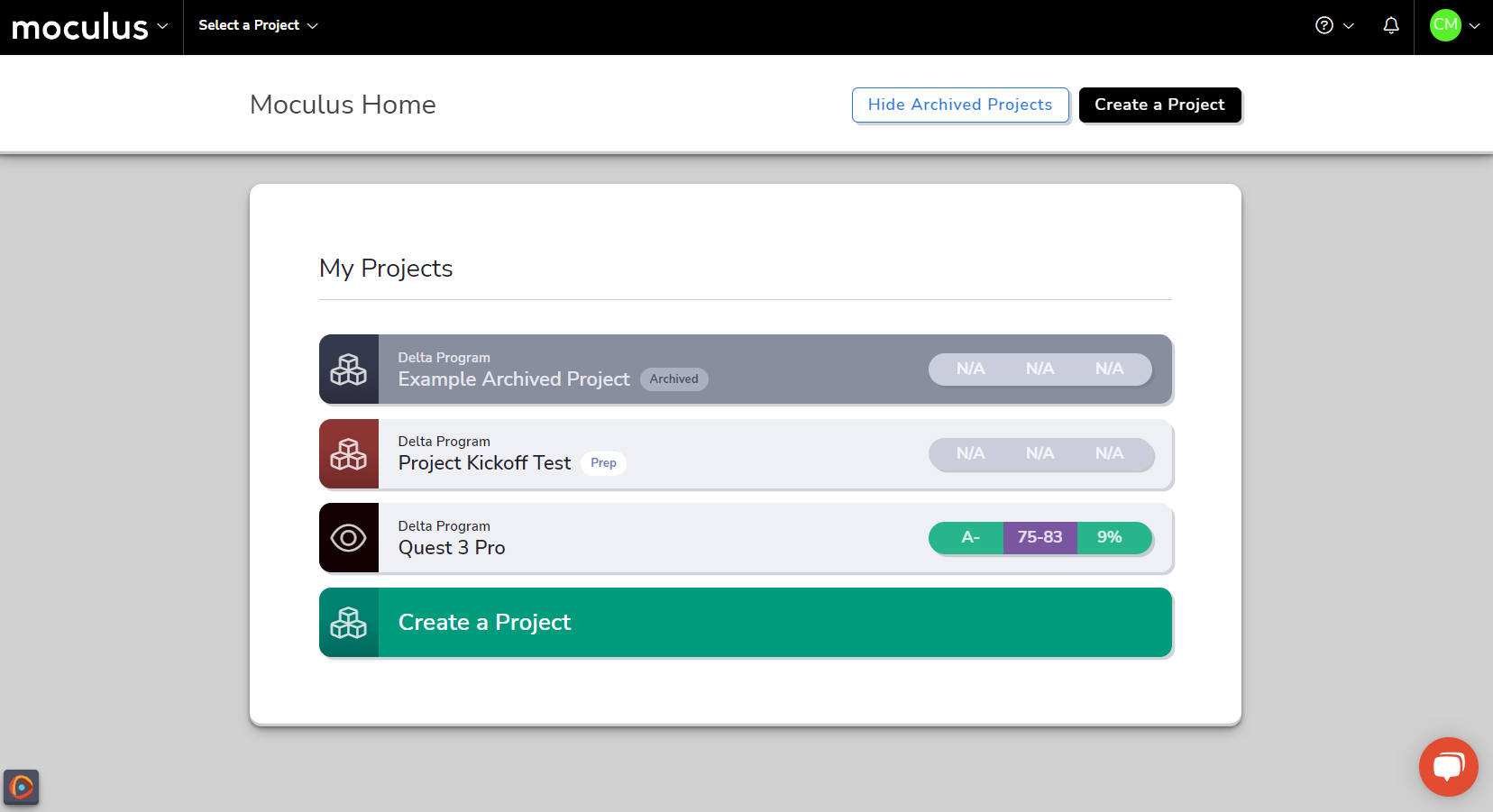
First on the list, we have a big visual update to how projects and opportunity lists are displayed on the community homepage! In addition to a bolder and more readable style, additional information and functionality has been added to the lists. The "My Projects" heading groups all the projects a user has access to, lists them alphabetically by codename, and shows which program it belongs to. Additionally, there's a tag that shows the current testing state of the project based on its current active phase type (if applicable).
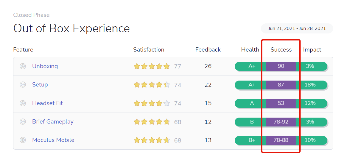
Next up, we're giving the Delta Success Score a new uniform! Previously, your success score would display as red, yellow, or green, depending on a predefined low/medium/high score range. For now, we've provided a single color (Purple!) to represent this score, allowing you to focus more on the number itself as a key metric to measure your projects and your program.
The motivation for this change (based on your insightful feedback!) is that the definition of success will differ from product to product based on the ambitions of and investments in that product. That definition is currently not present in Centercode (spoiler: we're working to add it), so there was a reasonable possibility that we were using a negative color to represent what was actually a positive outcome.
And last, but definitely not least, we've done a HUGE amount of UI polish throughout the platform. You'll notice these small but impactful tweaks on nearly every page, from adjusted padding and shadows to cleaner font weights and table styles. The list is long! We're always striving to improve, and we put a lot of work into this one. You can reach out to us via any of our normal chat or email support channels to let us know what you think, we'd love to hear your feedback!
We've got a big new feature for you this month, and we're not even making you wait until Christmas to open it! We're proud to announce that the "Include Users" option when creating a project from a template is back—and it's better than ever. Learn more about what you can do with it below, and keep reading to see the other bug fix stocking stuffers we've wrapped up this month.
" data-embed-image="https://i.vimeocdn.com/video/1557121235-650580de3381c33abe9146b058bc57f9b4c4c3b71ce2f1823613d5912bc76a81-d\_426" data-embed-signature="e4RfAcN2g4AwNTbm2uwVUbTwMIhWAHW6rewoHzRQoE1" data-embed-url="https://vimeo.com/775993354">
The ability to carry over users when templating and cloning a project is a powerful tool that can save a lot of time when you're spinning up a new project. But the original implementation of this feature was all-or-nothing while your use cases called for something more deliberate or selective.
Because of the overly wide net it cast, using Include Users usually resulted in more confusion and clean-up work than it was worth once the project was cloned. Therefore, we took it back to the drawing board, and with some incredibly useful feedback from our users, we're proud to bring the "Include Users" feature back with some major improvements.
You can now access "Template Users" from the Project Template Settings menu, under the "Template Users" heading. This replaces (and includes the functionality of) the "Initial Team Membership" section. Adding "Include Users" to the project template process, instead of an ad-hoc decision you have to remember to make every time you clone a project, ensures you'll only need to set these options once to get the same results with each new project you clone from a template.
If you’re a project coordinator who maintains your templates and/or hands-off projects to PMs who request them, this also reduces the amount of follow-up needed to get your template ready for hand-off.
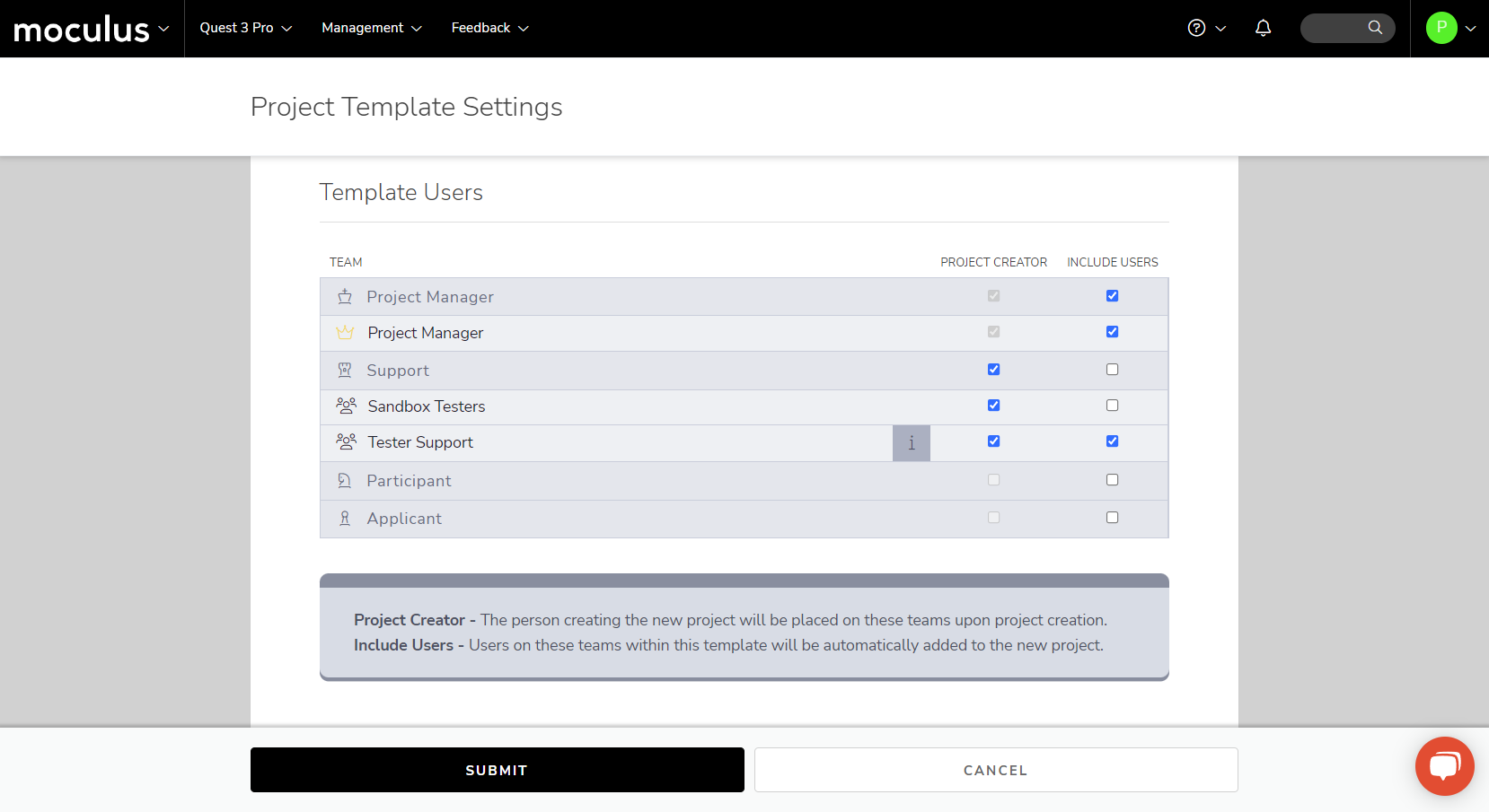
Additionally, the new Template Users section lets you get more granular by giving the option to select a specific team type (and individual teams for applicable Centercode editions).
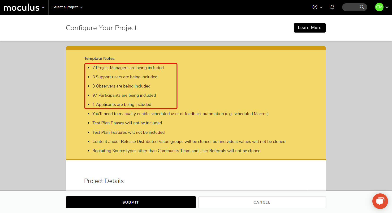
Finally, to support this new feature, we've added some additional items to the Template Notes infobox that appears when you're configuring a new project during the cloning process. It now lists the specific number of users in each team type that will be included in the cloned project.
Using this powerful new function of the project template tool will make getting new projects up and running smoother than ever! Simply add your admin and support staff to the right teams and update your template to ensure the right people will be automatically included on every project using this template going forward.
In addition to the big gift you've all been looking forward to, we've added a few ease-of-use updates to make your Centercode experience that much more comfy (like a nice warm pair of Centercode socks). We've started adding more context to our checkboxes to give you a better idea of what each one does. It's part of our ongoing effort to help you make the most of everything the Centercode Platform has to offer. And like a fruitcake that never seems to disappear….You'll see more of these holly jolly improvements into 2023.
This month, we’ve got a veritable banquet of new features and improvements prepared for you! From new in-line image list view CDE items, to a quality-of-life improvement for project archiving, there’s something tasty for everyone. And as usual, we've continually deployed several bug fixes throughout the month that we've listed below.
There's still time to enter October's Visual Theme Costume Contest. We're accepting screenshots until November 11th! Whether your site's theme is colorful or monochromatic, edgy or classy, this is a great opportunity to get your name out there in the world and score a little prize on the side! Check out the Announcement below for information on how to participate.
" data-embed-image="https://i.vimeocdn.com/video/1540735468-100f934dd58c6d50681ad6fb1967ece90e1bcc74136ba210d90efc24a0fd94e0-d\_426" data-embed-signature="jt3jpxvg1jb3cETvFLKyLKnvfp6WQkytLNeU24m28LI" data-embed-url="https://vimeo.com/767416000">
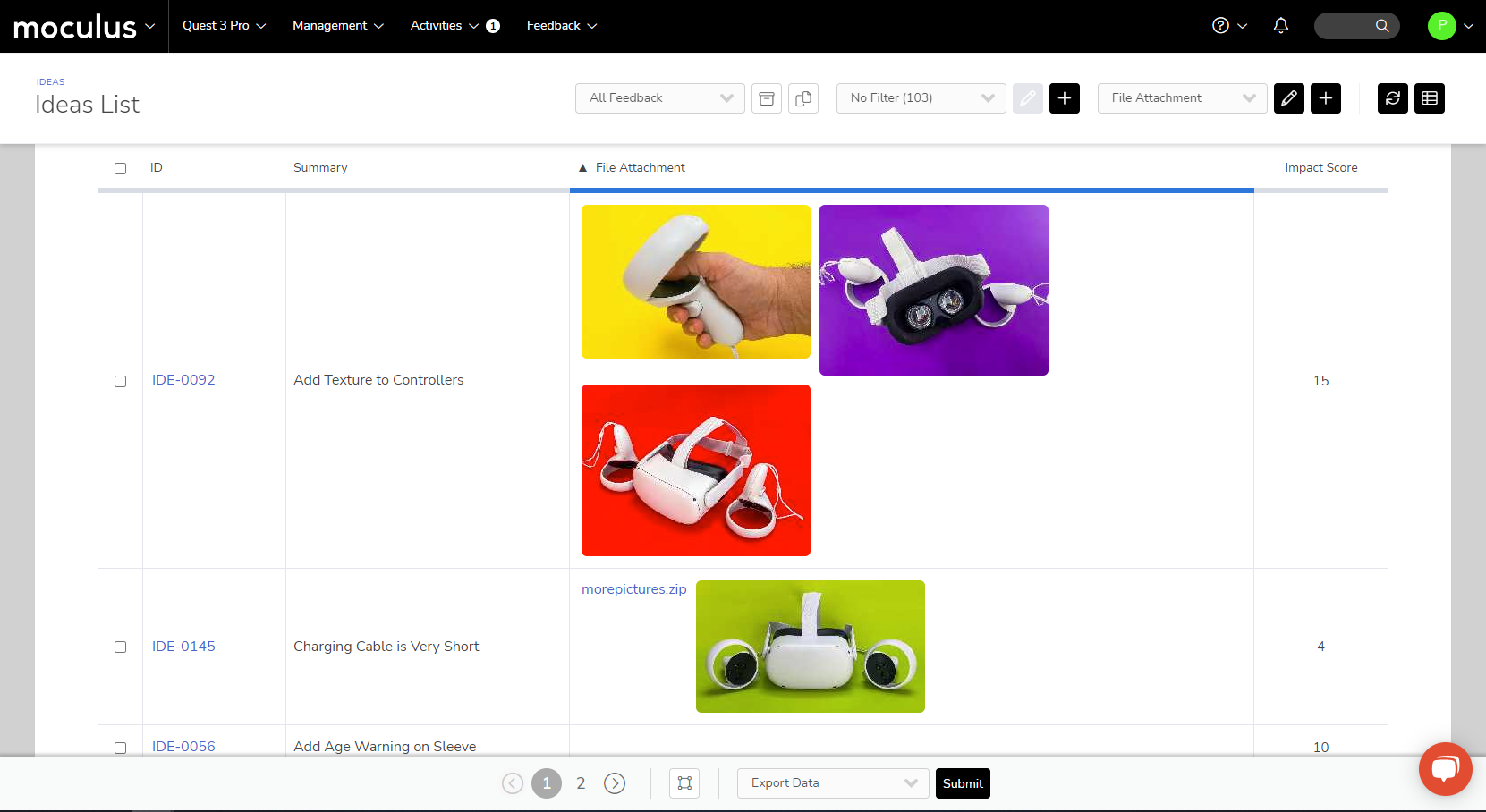
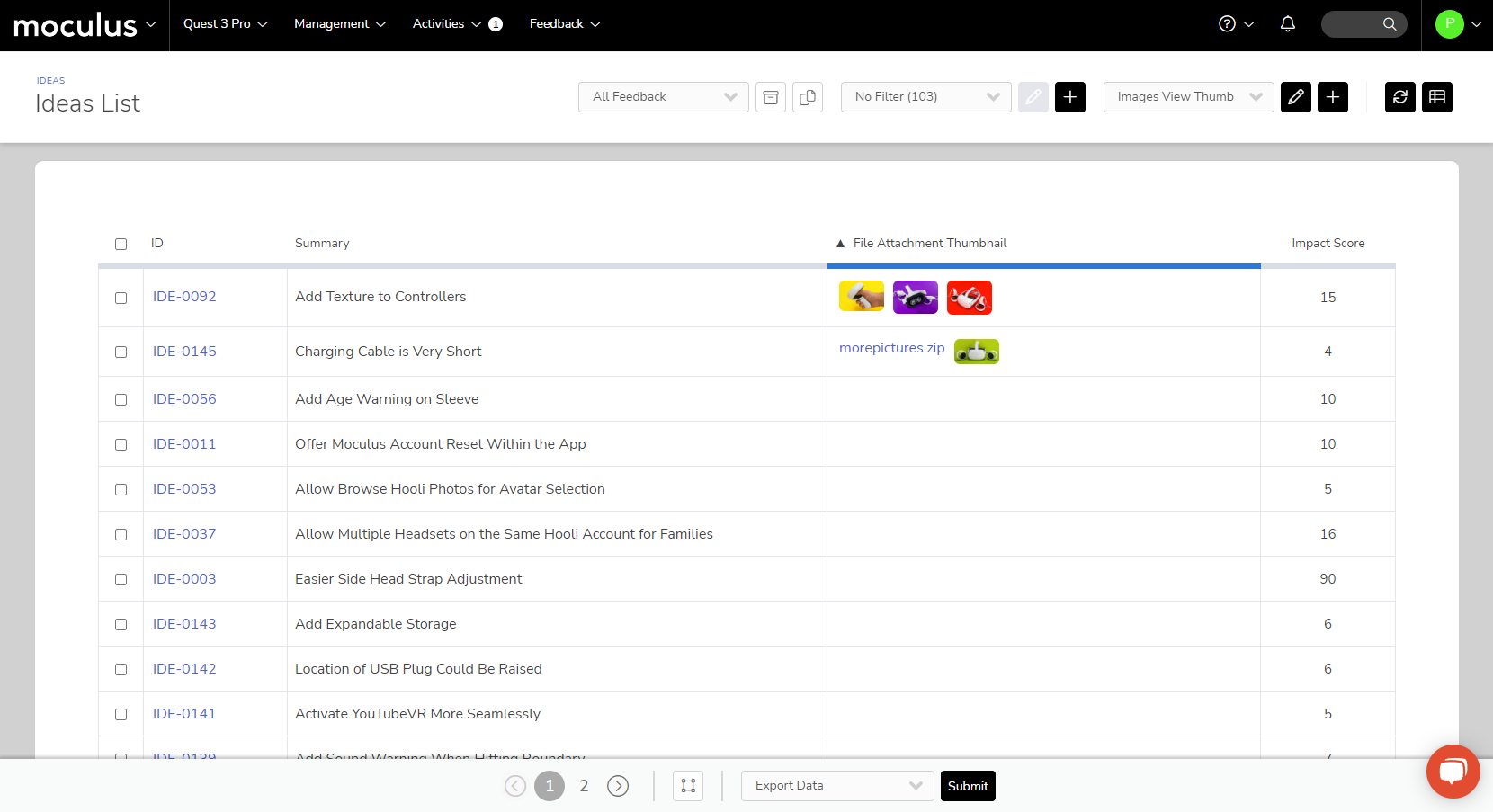
First on the menu is a dish many of you have asked for: inline images and image thumbnails in your user management and feedback management list views. These new data points for the Centercode Data Engine have been a popular request, and we're excited to finally share it with you!
When creating a user or feedback view, you’ll notice three different view items related to file attachment form elements. These new items make it much simpler to get an in-platform view of images and files uploaded by users for specific forms.
“File Attachment Has Attachment” gives you a binary yes/no response if the user attached any files at all.
“File Attachment” shows a scaled version of the image inline:
“File Attachment Thumbnail” shows thumbnail versions of attached images:
For our second course we’ve added the ability to archive a project from within the project itself. You’ll no longer need to navigate to Programs and Projects and find the specific project on the list (though that method is still available!). This option is located in the Project Configuration section of the Management menu when you're in a project.
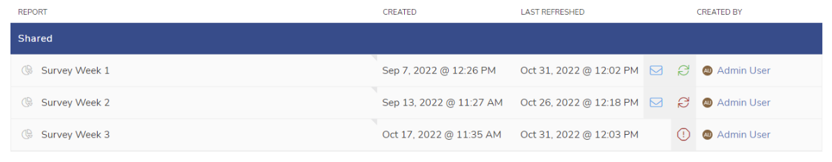
And last, but not least, is a feature designed to help you when your plate's piled a bit too high with automatically refreshing and distributed reports. We’ve implemented a new system that will automatically disable any reports that no one has viewed or interacted with in an extended period of time. This keeps your data fresh and your inbox uncluttered by old report emails you haven’t gotten around to turning off yet! (Note: This only applies to reports set to daily or weekly refreshes/distribution. Monthly reports will never automatically disable themselves.)
You’ll be notified of this two different ways:
A new set of icons on the Report Management screen will show the status of reports that are set to auto-refresh. Green circle arrows indicate that a report is set to auto-refresh and has been viewed recently. Red circle arrows indicate that a report has not been viewed recently and will automatically deactivate soon. A red warning sign indicates that a report was set to auto-refresh, but it reached the time limit without being viewed, so it's been disabled.
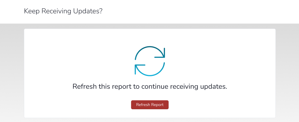
When a report goes unviewed for an extended period of time, the people on its distribution list see an expiration warning at the top of their email with a link to refresh the report. To refresh it, they don't have to login—it just takes one user to follow the link and confirm that they'd like to keep receiving updates. This resets the report's expiration date and keeps it auto-refreshing and sending updates. No muss, no fuss!
This month we’re bringing you our spoookiest update yet! October’s release is primarily focused on under-the-hood updates, lurking in the shadows just out of sight (See, spooky!). Our recent releases have introduced quite a few new UI elements which take cues from your visual theme. We thought this would be a seasonally appropriate time to help you dress up your testing community by bringing you some new and improved Visual Theme-focused content!
We’re holding a Visual Theme contest to spotlight your hard work and celebrate those who take the extra step! If you’ve got a good looking site, this is a great opportunity to get your name out there in the world and maybe get a little something on the side! Alternatively, if you’re not happy with your theme, we can help (but you’ll be DQd from the contest)! Check out the Announcement below for information on how to participate.
" data-embed-image="https://i.vimeocdn.com/video/1517368494-5ef04853467d9fa9347dee58964757cbc6a8964efcaa6f6934c6c1b967b2d606-d\_426" data-embed-signature="RKno2B666V8BrqDUHEi7kF0ziAIEkAcndwzdJjejttR" data-embed-url="https://vimeo.com/755280907">
All About Visual Themes!
Our first piece of content focuses on explaining the value of a good Visual Theme, and the influence it can have on tester enthusiasm and participation. To help get those creative juices flowing we also provide a number of example templates, a few helpful tips and tricks, and a curated collection of background images.
Next up we have a brief (but informative!) article with step-by-step instructions on how to access the Visual Theme tools, and how to apply your themes throughout your site once they’ve been created.
And last, but not least, we’ve created a detailed guide explaining how each of the Custom Images and Custom Color will affect your site, each with accompanying images of some of the more prominent places you’ll see those changes.
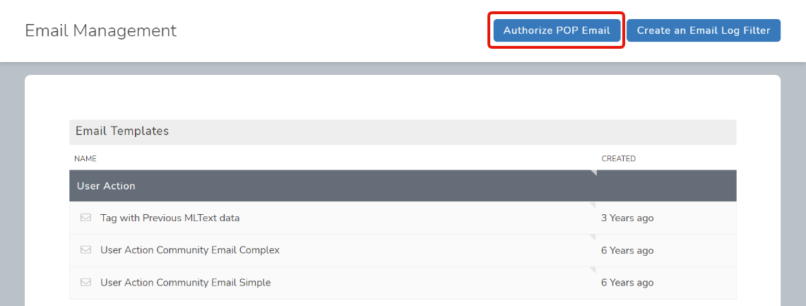
We've added the ability for customers to utilize OAuth to authenticate their email accounts used in email reply integrations (a.k.a. “POP Integrations”). Once it’s enabled on the back-end, you can access this function via a button on the community level Email Template and Logs page. If you have an existing email reply integration that either uses or needs to be updated to use OAuth, let us know so we can make the necessary adjustments.
Like a haunted house covered in sheet-ghosts and fake cobwebs (or toilet paper), the appearance of your testing site significantly impacts your testers’ perception of your program.
A well-presented site can elevate tester enthusiasm, brand confidence, and even professionalism. To help maximize your candy (feedback) haul this season, we’re holding a customer contest for the best-dressed site and giving out prizes for the best-in-show! You may or may not see some of our favorites showcased in the future… 🧙🔮
We can only accept one submission per customer site, and only one prize per company. If we get more than one submission for a site, we'll use the first one—and that submitter will receive any contest results or prizes.
Submissions must be received throughout October through November 11, 2022. Winners will be announced in the November Newsletter.
Themes will be evaluated based on specific criteria including accessibility, use of brand colors, cohesiveness, creativity, and some spooky mystery categories.
This contest is only open to customers who have implemented their own themes. While we're always willing to help you design your site's look, themes created by Centercode employees (via Services or otherwise) don’t qualify for this contest.
Full-sized candy bars only; no apples.
Submit two screenshots of your site on or before November 11th: one of the login page, and one of the User Management page, as shown in the examples below. Send your submissions via email to contests@centercode.com with the subject line: “Visual Theme Contest”. Include your screenshots and any details you’d like to call attention to such as the name of your theme, special notes about it, etc.
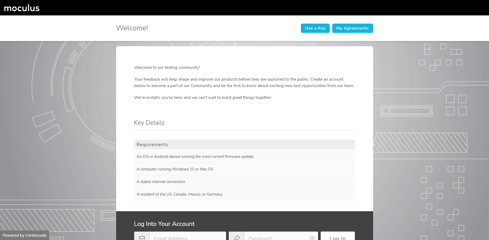
https:///welcome/
https:///community/users/default.html
First, take a screenshot of your site (Windows: [Windows]+[Shift]+S, Mac: [Shift]+[Command]+3). Then simply paste (Windows: [Control]+V, Mac: [Command]+V) in your email to add the screenshot. Repeat for each screenshot you want to take. Finally, just send it our way and you're all set!